Visualize Experiment Results with Plots
This example shows how to interpret and compare the results of individual trials in Experiment Manager using plots. You might want to visualize the results of an experiment when the relationship between multiple output variables or output variables and time is important.
In this example, you use a simple experiment that computes and visualizes sine and cosine waves over the range -pi to pi, using different scaling factors for the x-values. You visualize the experiment results by taking these steps:
Define plots in the experiment function.
Specify a name and labels for the plots.
View the plots for a trial.
Create Experiment Using Template
You can access templates on the Experiment Manager start page. Open the Experiment Manager app. Then, on the start page, click New > Project > Blank Project, and choose the General Purpose template.
Specify Parameter
In the Experiment Manager app, add the parameters for your experiment.
For example, add and configure a parameter c. Experiment Manager will run the experiment using all the possible values of c. In the Parameters section of the experiment editor, click Add and then set the parameter name to c and its value to 1:4.
Name | Values |
|---|---|
|
|
Specify Experiment Function
The experiment function defines the procedure for each experiment trial. In the experiment function, you can also generate plots.
For example, create an experiment function that computes and plots scaled sine and cosine waves using a scaling factor c. To open the experiment function, click Edit in the Experiment Function section of the experiment editor.
function [y1,y2] = Experiment1Function1(params)
c = params.c;
x = -pi:0.01:pi;

y1 = sin(c*x);
y2 = cos(c*x);

figure(Name="Sine Wave")
plot(x,y1)
title(["Scaled Sine Wave When c = " + num2str(params.c)])
xlabel("x")
ylabel("sin(c*x)")

figure(Name=["Cosine Wave" + num2str(params.c)])
plot(x,y2)
title("Scaled Cosine Wave When c = ")
xlabel("x")
ylabel("cos(c*x)")
end
Then save and close your experiment function file.
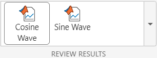
When this experiment function runs for each trial, the function creates two plots and stores the plots in the project. The value of the Name property of each figure appears as the name of a button in the Review Results section of the toolstrip after the experiment runs.
Run Experiment and View Plot
After you configure the experiment, you can run it by clicking Run on the Experiment Manager toolstrip. Experiment Manager calls the experiment function for each parameter value and records the results and the corresponding plots.
For example, run the experiment and select a trial in the results table. Then, open the cosine wave plot by clicking Cosine Wave in the Review Results section of the toolstrip.

To view the cosine wave plot for a different trial, click a different row in the results table. To view the sine wave plot for the selected trial, click Sine Wave in the Review Results section of the Experiment Manager toolstrip. You can view only one plot for one trial at a time.
Save or Copy Plot
To save or copy a plot, click the button at the top-right corner of the plot. Then, in the expanded axes toolbar, select an export option. You can choose to save the plot as a file, or copy the plot as an image or vector graphic.