Identify and Visualize Correlated Variables
When analyzing the relationships between data variables, you can identify and visualize correlated variables to gain insights into the data set. This example shows how to determine the strength and direction of relationships by using the corrcoef function to calculate correlation coefficients. The correlation coefficients range from –1 to 1, where:
Values close to 1 indicate a positive linear relationship between the data variables.
Values close to –1 indicate a negative linear relationship between the data variables (anticorrelation).
Values close to or equal to 0 suggest no linear relationship between the data variables.
Additionally, this example shows how to determine which correlations are significant and identify the most correlated pairs. The example plots correlations using a heatmap and bar chart, so you can visually compare the relationships between variables.
Compute Correlation Coefficients and P-Values
Generate random data with correlations among variables. Then, use the corrcoef function to calculate the correlation coefficients and corresponding p-values that describe the significance of the correlations.
rng(16)
A = randn(50,6);
A(:,3) = A(:,3) + 2*A(:,1);
A(:,4) = A(:,4) - 3*A(:,2);
A(:,5) = A(:,6) + 0.1*A(:,4) - 0.1*A(:,3);
[R,P] = corrcoef(A)
R = 6×6

    1.0000   -0.1248    0.8047    0.1300   -0.1726   -0.1009
   -0.1248    1.0000   -0.0744   -0.9612   -0.2314    0.0730
    0.8047   -0.0744    1.0000    0.0709   -0.3595   -0.2515
    0.1300   -0.9612    0.0709    1.0000    0.2611   -0.0549
   -0.1726   -0.2314   -0.3595    0.2611    1.0000    0.9384
   -0.1009    0.0730   -0.2515   -0.0549    0.9384    1.0000
P = 6×6

    1.0000    0.3878    0.0000    0.3683    0.2308    0.4858
    0.3878    1.0000    0.6075    0.0000    0.1060    0.6143
    0.0000    0.6075    1.0000    0.6248    0.0103    0.0781
    0.3683    0.0000    0.6248    1.0000    0.0670    0.7051
    0.2308    0.1060    0.0103    0.0670    1.0000    0.0000
    0.4858    0.6143    0.0781    0.7051    0.0000    1.0000
The returned matrices R and P, which contain the correlation coefficients and the p-values respectively, are symmetric. Extract the lower triangular part of R to focus on unique pairwise correlations.
R = tril(R,-1)
R = 6×6

         0         0         0         0         0         0
   -0.1248         0         0         0         0         0
    0.8047   -0.0744         0         0         0         0
    0.1300   -0.9612    0.0709         0         0         0
   -0.1726   -0.2314   -0.3595    0.2611         0         0
   -0.1009    0.0730   -0.2515   -0.0549    0.9384         0
Visualize Correlations Using Heatmap
Create a heatmap of the correlation coefficients to visualize the strength and direction of relationships between variables.
Convert the zeros in the correlation coefficient matrix, which mirror the redundant elements of the lower triangle correlations, into missing values (NaN). Next, create a colormap where variable pairs with negative correlations are in red, pairs with positive correlations are in blue, and pairs with no correlation are in white. The heatmap highlights the strongest correlations in bright red and bright blue.
Rheatmap = standardizeMissing(R,0);
map = [1 0 0;
    0.9 0.3 0.3;
    0.9 0.6 0.6;
    1 1 1;
    0.6 0.6 0.9;
    0.3 0.3 0.9;
    0 0 1];
h = heatmap(Rheatmap,Colormap=map,ColorLimits=[-1 1]);
h.Title = "Correlation Coefficients";
h.YLabel = "First Variable";
h.XLabel = "Second Variable";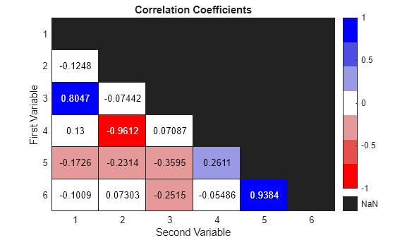
Determine Significant Correlations
Identify significant correlations by filtering out those with a p-value greater than 0.05. This approach focuses the analysis only on relationships that are statistically meaningful and avoids interpreting random noise as a correlation.
threshold = 0.05;
R(abs(P) > threshold) = 0;
[firstVar,secondVar,corrCoef] = find(R)
firstVar = 4×1

     3
     4
     5
     6
secondVar = 4×1

     1
     2
     3
     5
corrCoef = 4×1

    0.8047
   -0.9612
   -0.3595
    0.9384
Display Correlations in Table
Compile significant correlations in a table, including indices, correlation coefficients, and p-values.
ind2 = sub2ind(size(P),firstVar,secondVar);
sigP = P(ind2);
TSig = table(firstVar,secondVar,corrCoef,sigP)
TSig=4×4 table
    firstVar    secondVar    corrCoef       sigP
    ________    _________    ________    __________

       3            1         0.80471    1.8997e-12
       4            2        -0.96118    1.7065e-28
       5            3        -0.35949      0.010346
       6            5          0.9384    8.5819e-24
List the top three correlations by magnitude. The top correlations are consistent with the relationships established in the input data.
A(:,3) = A(:,3) + 2*A(:,1);
A(:,4) = A(:,4) - 3*A(:,2);
A(:,5) = A(:,6) + 0.1*A(:,4) - 0.1*A(:,3);
k = 3;
TTopk = topkrows(TSig,k,"corrCoef","descend",ComparisonMethod="abs")
TTopk=3×4 table
    firstVar    secondVar    corrCoef       sigP
    ________    _________    ________    __________

       4            2        -0.96118    1.7065e-28
       6            5          0.9384    8.5819e-24
       3            1         0.80471    1.8997e-12
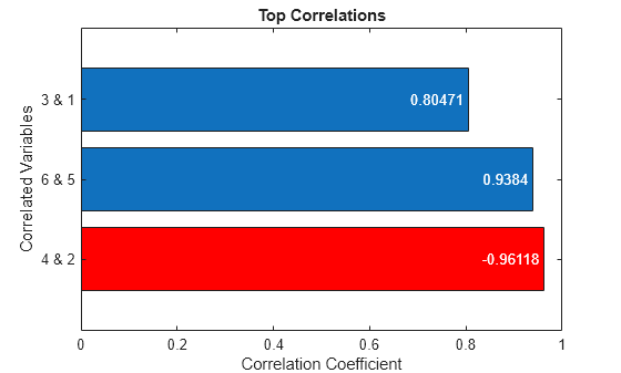
Visualize Top Correlations Using Bar Chart
Display the three most significant correlations using a horizontal bar chart. Represent negative correlations with red bars and positive correlations with blue bars.
labels = TTopk.firstVar + " & " + TTopk.secondVar;
b = barh(labels,abs(TTopk.corrCoef));

negCorr = TTopk.corrCoef < 0;
b.FaceColor = "flat";
b.CData(negCorr,:) = repmat([1 0 0],nnz(negCorr),1);
b.Labels = TTopk.corrCoef;
b.LabelLocation = "end-inside";

title("Top Correlations")
xlabel("Correlation Coefficient")
ylabel("Correlated Variables")