Detect Anomalies Using Visual Anomaly Detector
R2026bThis example shows how to detect and localize industrial production defects in images using a trained anomaly detector in the Visual Anomaly Detector app.
Detect Anomalies in Test Data
To open the Visual Anomaly Detector app, click the Apps tab on the MATLAB Toolstrip. Then, in the Image Processing and Computer Vision section of the apps gallery, select Visual Anomaly Detector. Alternatively, open the Visual Anomaly Detector app programmatically.
visualAnomalyDetector
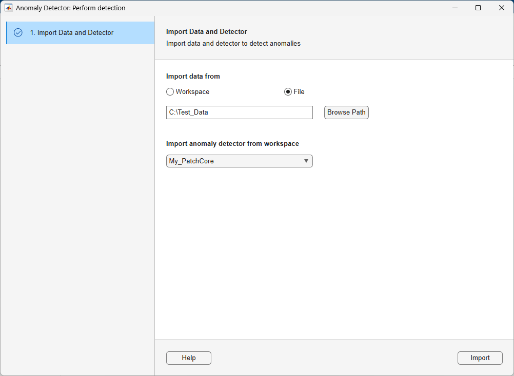
To load the test data, on the Detector tab of the app toolstrip, select New Session > Perform Detection. In the dialog box that opens, import the test data and trained detector by performing these steps:
Under Import data from, select File and then click Browse Path to select the path to the folder containing your test data. Alternatively, you can load test data from workspace by selecting the Workspace option. For PatchCore anomaly detectors, test images must be the same size as the images used to train the detector.
To select the trained detector, choose one from the Import anomaly detector from workspace list. Then click Import. You must load the trained detector into the workspace.
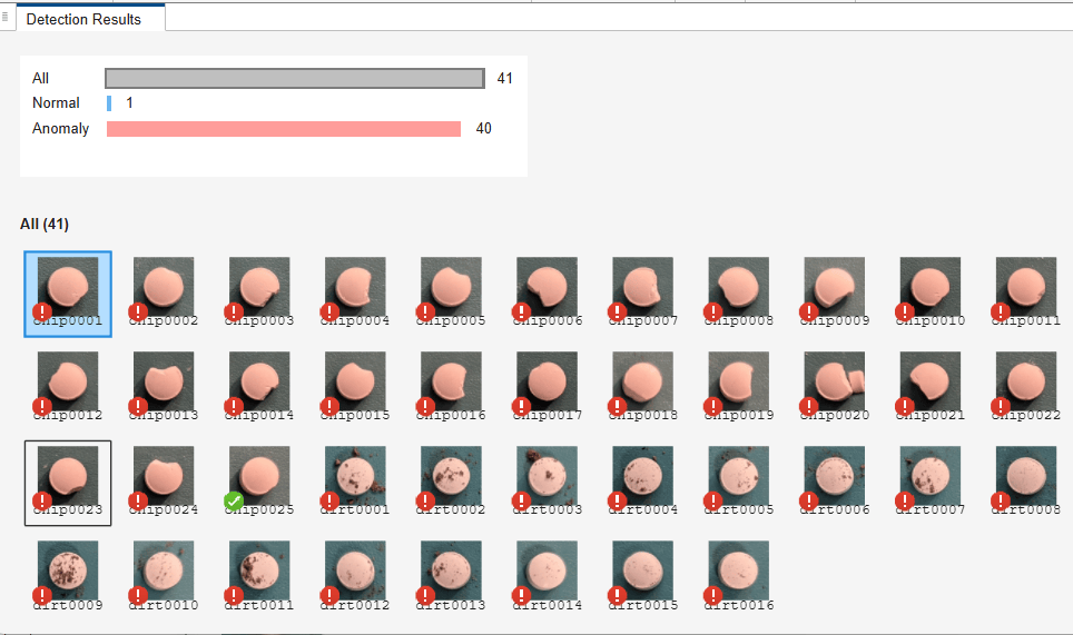
After you import the data and detector, the app runs inference on the test data and opens the View Decision tab. There, you can visualize the test results of each test image. The badges on each image indicate the classification result. A green check identifies an image in the Normal category, while a red warning badge identifies an image in the Anomaly category. Click the corresponding result category to display the test images under that category. To filter test images by category, click the category name or its summary bar. For example, to visualize the images categorized as normal, click the blue bar next to Normal.
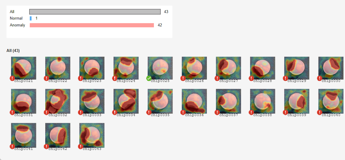
In addition to the classification results, you can visualize anomaly information as a heatmap overlay to help locate defects. To normalize the anomaly score map using percentiles, select Normalize Anomaly Score. To visualize the heatmap of the images for the selected normalized score map, select Show Heatmap. The heatmap of each image represents the probability of anomaly at each pixel, which helps you understand why the app classified the image as normal or anomalous.
The detector labels images as normal or anomalous based on the mean value of the anomaly score heatmap. You can adjust the visualization of the heatmap using the Blend Type, Colormap, and Opacity parameters. To close the visualization, click Close View Decision.
See Also
Visual
Anomaly Detector | patchCoreAnomalyDetector | trainPatchCoreAnomalyDetector | anomalyMap | anomalyThreshold | evaluateAnomalyDetection

