Explore 3-D Volume Data Using Custom Volume Exploration Tool
R2026bThis example shows how to use VolumeShow, a custom volume exploration tool, to display and explore 3-D volumetric data. VolumeShow is a UI component built using App Designer. Use this component to interactively rotate, zoom, and pan 3-D volume data with configurable rendering styles and colormaps. When you select "SlicePlanes" rendering, the component displays a synchronized 2-D slice view that updates as you drag the slice planes in the 3-D viewer. The component wraps volshow with a synchronized colorbar and a 2-D slice panel for cross-sectional navigation. You can also embed the component in a UI figure, use UI control callbacks to update rendering styles and colormaps, and dynamically update the volume visualization.
Call VolumeShow to open the UI and inspect its properties. The UI displays a 3-D volume viewer with a synchronized colorbar and interactive controls.
VolumeShow
ans =
  VolumeShow with properties:

          VolumeData: []
            Colormap: [256×3 double]
      RenderingStyle: "VolumeRendering"
    SlicePlaneValues: []
            Position: [1 1 728 495]

  Show all properties
The VolumeShow component has these configurable properties:
VolumeData— 3-D volumetric data, specified as a 3-D numeric arrayRenderingStyle— Volume rendering style, specified as any rendering style supported by thevolshowfunction. The default value is"VolumeRendering"Colormap— Color mapping for the volume data, specified as a named colormap string or an N-by-3 array of RGB triplets. The default value is"parula"
You can specify these properties as name-value arguments during construction or use dot notation after construction to assign property values.
Load and Display Volume Data
Load MRI data and convert it from a 4-D array to a 3-D volume. Create a VolumeShow component and specify the volume data as a name-value argument. The component displays the volume with the default rendering style and colormap. Use the interactive controls at the top of the viewer to pan, zoom, and rotate the volume.
load mri.mat
D = squeeze(D);
comp = VolumeShow(VolumeData=D);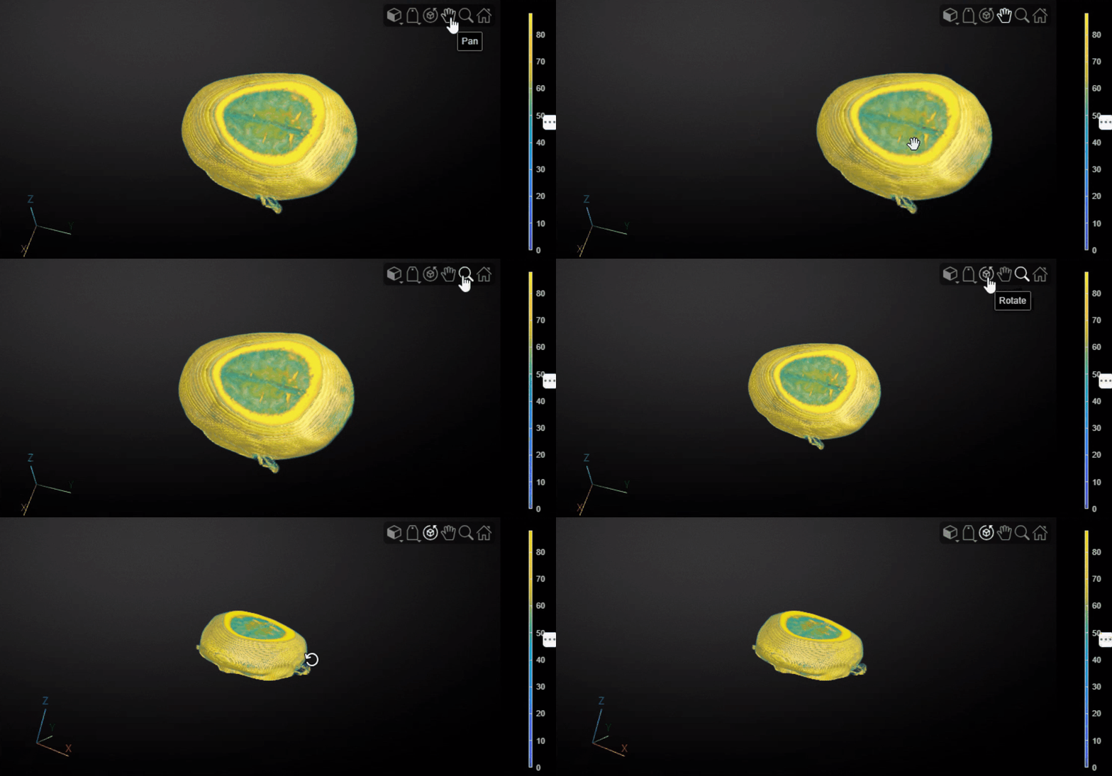
Change Rendering Style and Colormap
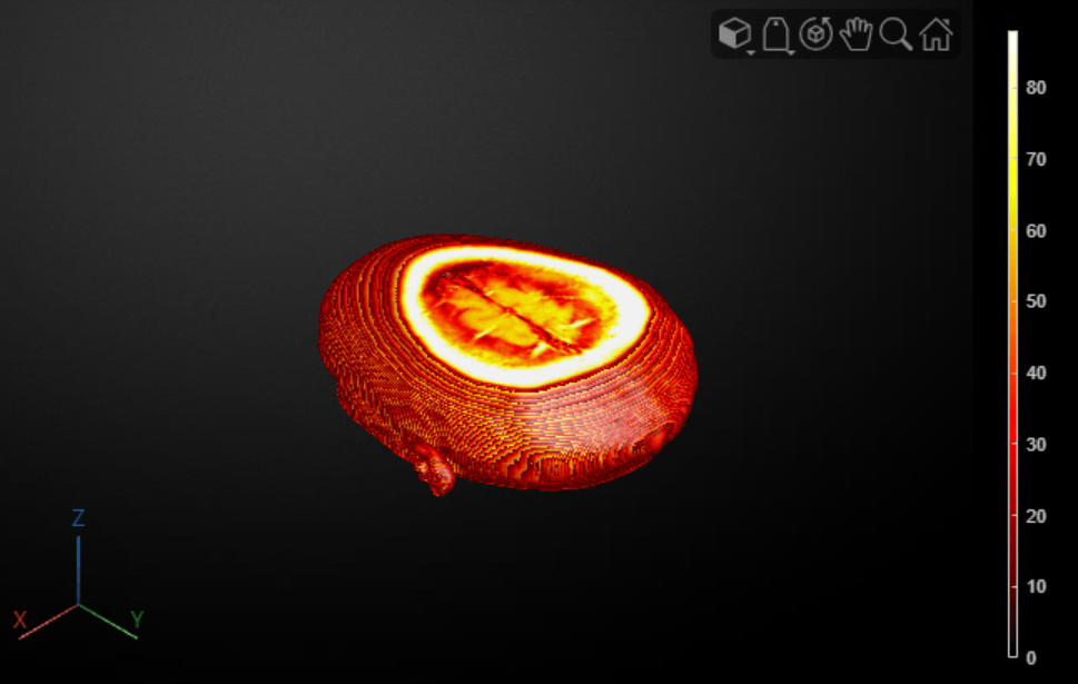
Set the RenderingStyle property to control how the component displays the volume. The component updates the visualization immediately. Set the Colormap property to control how data values map to colors. The colorbar updates automatically to reflect the new colormap.
comp.RenderingStyle = "Isosurface";
comp.Colormap = "hot";
Explore Slice Planes
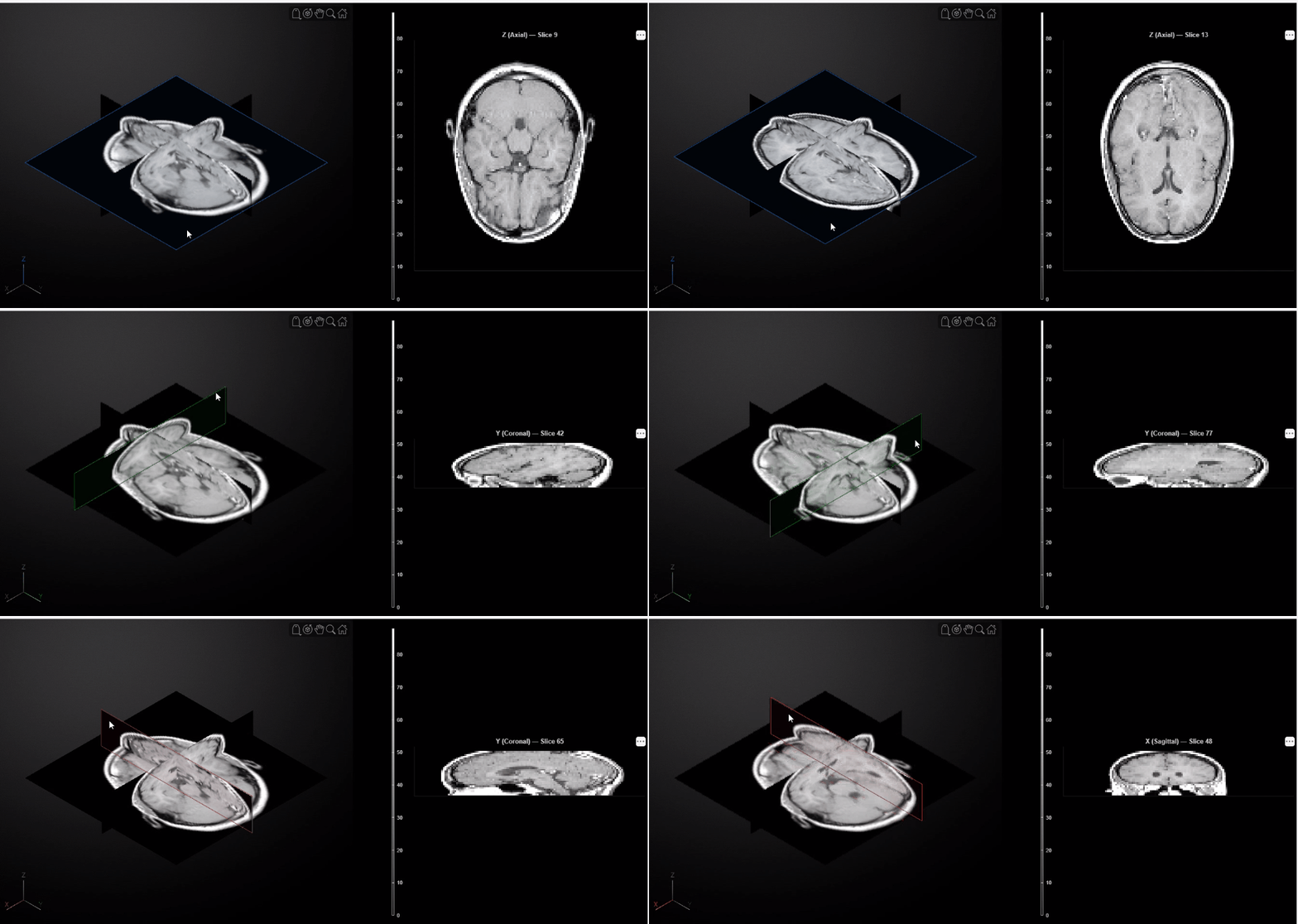
Set the rendering style to "SlicePlanes" to view cross-sections of the volume. The component displays three orthogonal slice planes (sagittal, coronal, and axial) in the 3-D viewer and a synchronized 2-D slice panel alongside it. Select any slice plane in the 3-D viewer to navigate through the volume. The 2-D panel automatically detects which plane you selected and displays the corresponding cross-section in real time.
comp.RenderingStyle = "SlicePlanes";
comp.Colormap = "gray";
Embed Component in UI Figure for Rendering Workflows
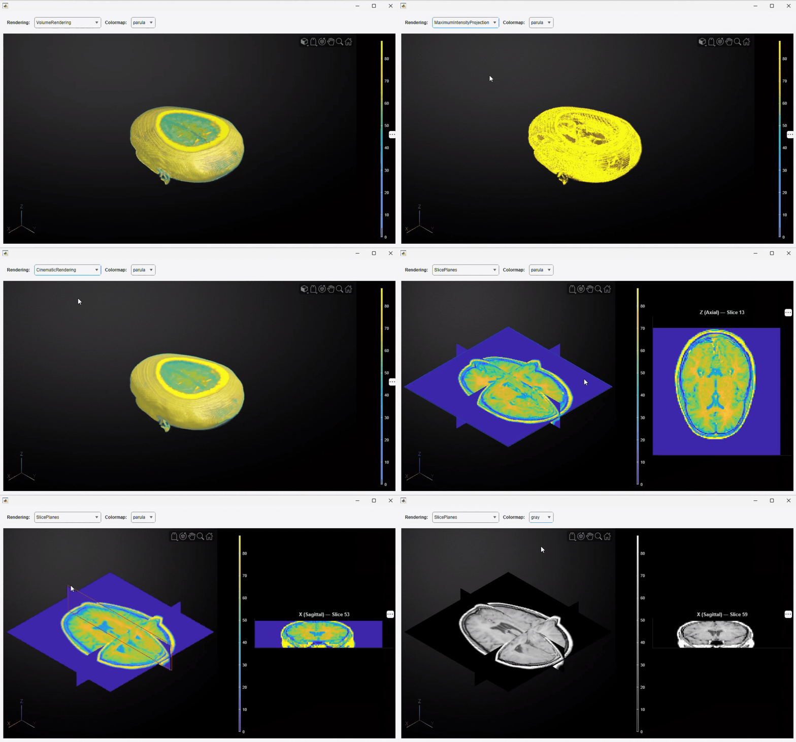
Embed the VolumeShow component in a UI figure alongside other controls to create an interactive visualization workflow. The following example adds two drop-downs that update the rendering style and colormap interactively.
Create a UI figure with a grid layout. The first row holds the controls and the second row holds the volume viewer.
fig = uifigure(Position=[50 50 900 450]);
gl = uigridlayout(fig,RowHeight={40,'1x'},ColumnWidth={'1x'});
Add a control panel with drop-downs for rendering style and colormap selection. The nested grid layout uses four columns, one for each label and drop-down, sized to fit their content.
controlPanel = uigridlayout(gl,RowHeight={'1x'},ColumnWidth={'fit','fit','fit','fit'},Padding=[10 5 10 5]);
uilabel(controlPanel,Text="Rendering:",FontWeight="bold");
ddRender = uidropdown(controlPanel,Items=["VolumeRendering","Isosurface","CinematicRendering","GradientOpacity","SlicePlanes","MaximumIntensityProjection"],Value="VolumeRendering");
uilabel(controlPanel,Text="Colormap:",FontWeight="bold");
ddColor = uidropdown(controlPanel,Items=["parula","hot","gray","jet","turbo"],Value="parula");
Embed the VolumeShow UI component by passing the grid layout as the parent argument. Specify the volume data and initial rendering properties as name-value arguments.
comp2 = VolumeShow(VolumeData=D,RenderingStyle="VolumeRendering",Colormap="parula",Parent=gl);
Assign ValueChangedFcn callbacks to the drop-downs that update the component rendering style and colormap when the selection changes.
ddRender.ValueChangedFcn = @(src,~) set(comp2,"RenderingStyle",src.Value);
ddColor.ValueChangedFcn = @(src,~) set(comp2,"Colormap",src.Value);
Customize Component in App Designer
You can modify the VolumeShow UI component by opening it in App Designer. The App Designer provides two views: Design View, which displays the component layout, and Code View, which contains the source code of the component.
Use Design View to adjust the layout, add new UI elements, or rearrange existing controls.
Use Code View to inspect and modify the component implementation code.
The component is stored as a .mlapp file, and you can export the component implementation to a MATLAB code file (.m). Open the VolumeShow UI component in App Designer by running this command in the Command Window:
appdesigner("VolumeShow")
See Also
Apps
Properties
Functions
volshow|uifigure|uilabel|uigridlayout|uidropdown

