Create App That Updates Based on Theme
This example shows how to create an app in App Designer that visually adapts to light and dark themes. The app building strategies in this example are useful if you are creating an app to share with others because the app users might be using either theme on their systems.
You can choose colors and icons that update automatically when the app theme changes or write code to update custom colors and images based on the current theme.
To learn more about how MATLAB® manages themes for graphics and apps, see Graphics and App Themes.
Specify App Colors
Design and program your app so that colors of UI components and plots work well with the theme of the figure. Manage colors using one of these strategies:
Use the default colors of objects.
Update manually set colors in a
ThemeChangedFcncallback function.
If the default colors of app elements work with your app design, use those colors instead of manually specifying color properties. MATLAB automatically updates any default colors based on the current theme of the app. For example:
Use the default color for text in the app by not setting the
FontColorproperty ofLabelobjects. The text appears dark in light theme and light in dark theme.Use the default colors for plotted data by not specifying manual color data. Default plot colors change slightly when the theme changes to provide good contrast with the axes color. If you have more complex plots with multiple colors, you can use the
SeriesIndexproperty of the graphics objects to specify colors relative to the color order of the axes. For more information, see Control Automatic Selection of Colors and Line Styles in Plots.
If you manually specify colors for app elements, update the colors based on the current figure theme by using a ThemeChangedFcn callback. This callback executes whenever the figure theme changes. To create a ThemeChangedFcn callback function in App Designer, select the app.UIFigure element in the Component Browser. In the Callbacks tab, next to ThemeChangedFcn, select <add ThemeChangedFcn callback>.
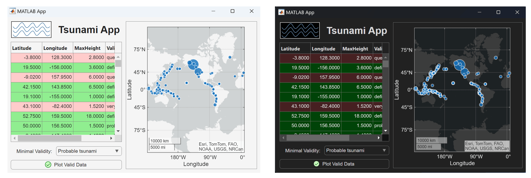
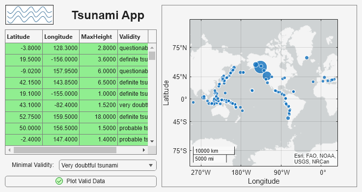
In this example, the app contains a table with valid rows highlighted in green and invalid rows highlighted in red. The app calls the following code from the ThemeChangedFcn callback function for the figure. The code updates the BackgroundColor property of the Style object that applies colors to the table rows. Use the fliplightness function to darken the light green and light red colors, which provides better contrast with the light text in the dark theme.
validcolor = "#90EE90"; % light green
invalidcolor = "#FFCCCB"; % light red
if app.UIFigure.Theme.BaseColorStyle == "light"
    app.ValidStyle.BackgroundColor = validcolor;
    app.InvalidStyle.BackgroundColor = invalidcolor;
elseif app.UIFigure.Theme.BaseColorStyle == "dark"
    app.ValidStyle.BackgroundColor = fliplightness(validcolor);
    app.InvalidStyle.BackgroundColor = fliplightness(invalidcolor);
end
Alternatively, instead of using the fliplightness function, you can directly specify the colors to use for each theme in the ThemeChangedFcn callback function.
if app.UIFigure.Theme.BaseColorStyle == "light"
    app.ValidStyle.BackgroundColor = "#90EE90"; % light green
    app.InvalidStyle.BackgroundColor = "#FFCCCB"; % light red
elseif app.UIFigure.Theme.BaseColorStyle == "dark"
    app.ValidStyle.BackgroundColor = "#004308"; % dark green
    app.InvalidStyle.BackgroundColor = "#462021"; % dark red
end
Specify App Images and Icons
Design and program your app so that images and icons in your app work well with the theme of the figure. Manage images and icons using one of these strategies:
Specify predefined icon values, such as
"warning"or"success".Update manually specified images and icons in a
ThemeChangedFcncallback function.
Any icons specified using predefined values automatically update when the figure theme changes. In this example, the app uses the predefined value "success" for the Icon property of a button. The icon automatically updates to use appropriate colors in both dark and light themes.
If you want to specify a custom icon or image that is not in the list of predefined values, use these steps:
Read the image as an
m-by-n-by-3 truecolor image array (for example, by using theimreadfunction).Specify the app property for the image source as the truecolor array.
Use the
ThemeChangedFcncallback function and thefliplightnessfunction to update the colors in the image when the theme changes.
In this example, the app includes an image saved as a PNG file, tsunamiImage.png. The app updates the image by storing the associated truecolor image as an app property (app.RGBImage) and then calling this code from the ThemeChangedFcn callback function.
im = app.RGBImage;
if app.UIFigure.Theme.BaseColorStyle == "light"
    app.Image.ImageSource = im;
elseif app.UIFigure.Theme.BaseColorStyle == "dark";
    app.Image.ImageSource = fliplightness(im);
end
Alternatively, instead of using the fliplightness function, you can maintain multiple copies of the image for different themes and then directly specify the image file to use for each theme in the ThemeChangedFcn callback function.
if app.UIFigure.Theme.BaseColorStyle == "light"
    app.Image.ImageSource = "lightThemeTsunamiImage.png";
elseif app.UIFigure.Theme.BaseColorStyle == "dark";
    app.Image.ImageSource = "darkThemeTsunamiImage.png";
end
View App in Different Themes
To see how your app looks in different themes, run the app from the MATLAB Command Window and set the figure theme.
app = ThemedTsunamiApp;
theme(app.UIFigure,"dark");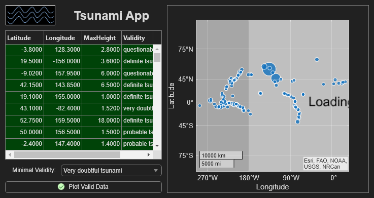