Working with the Clustergram Function
This example shows how to work with the clustergram function.
The clustergram function creates a heat map with dendrograms to show hierarchical clustering of data. These types of heat maps have become a standard visualization method for microarray data since first applied by Eisen et al. [1]. This example illustrates some of the options of the clustergram function. The example uses data from the van't Veer et al. breast cancer microarray study [2].
Importing Data
A study by van't Veer et al. investigated whether tumor ability for metastasis is obtained later in development or inherent in the initial gene expression signature [2]. The study analyzed tumor samples from 117 young breast cancer patients, of whom 78 were sporadic lymph-node-negative. The gene expression profiles of these 78 patients were searched for prognostic signatures. Of the 78 patients, 44 exhibited non-recurrences within five years of surgical treatment while 34 had recurrences. Samples were hybridized to Agilent® two-color oligonucleotide microarrays representing approximately 25,000 human genes. The authors selected 4,918 significant genes that had at least a two-fold differential expression relative to the reference and a p-value for being expressed < 0.01 in at least 3 samples. By using supervised classification, the authors identified a poor prognosis gene expression signature of 231 genes [2].
A subset of the preprocessed gene expression data from [2] is provided in the bc_train_filtered.mat MAT-file. Samples for 78 lymph-node-negative patients are included, each one containing the gene expression values for the 4,918 significant genes. Gene expression values have already been preprocessed, by normalization and background subtraction, as described in [2].
load bc_train_filtered
bcTrainData
bcTrainData =

  struct with fields:

       Samples: {78×1 cell}
    Log10Ratio: [4918×78 single]
     Accession: {4918×1 cell}
The list of 231 genes in the prognosis profile proposed by van't Veer et al. is also provided in the bc_proggenes231.mat MAT-file. Genes are ordered according to their correlation coefficient with the prognostic groups.
load bc_proggenes231
Extract the gene expression values for the prognosis profile.
[tf, idx] = ismember(bcProgGeneList.Accession, bcTrainData.Accession);
progValues = bcTrainData.Log10Ratio(idx, :);
progAccession = bcTrainData.Accession(idx);
progSamples = bcTrainData.Samples;
For this example, you will work with the 35 most positive correlated genes and the 35 most negative correlated genes.
progValues = progValues([1:35 197:231],:);
progAccession = progAccession([1:35 197:231]);
Clustering
You will use the clustergram function to perform hierarchical clustering and generate a heat map and dendrogram of the data. The simplest form of clustergram clusters the rows or columns of a data set using Euclidean distance metric and average linkage. In this example, you will cluster the samples (columns) only.
The matrix of gene expression data, progValues, contains some missing data. These are marked as NaN. You need to provide an imputation function name or function handle to impute values for missing data. In this example, you will use the k-nearest neighbors imputation procedure implemented in the function knnimpute.
cg_s = clustergram(progValues, 'RowLabels', progAccession,...
                               'ColumnLabels', progSamples,...
                               'Cluster', 'Row',...
                               'ImputeFun', @knnimpute)
Clustergram object with 78 columns of nodes.
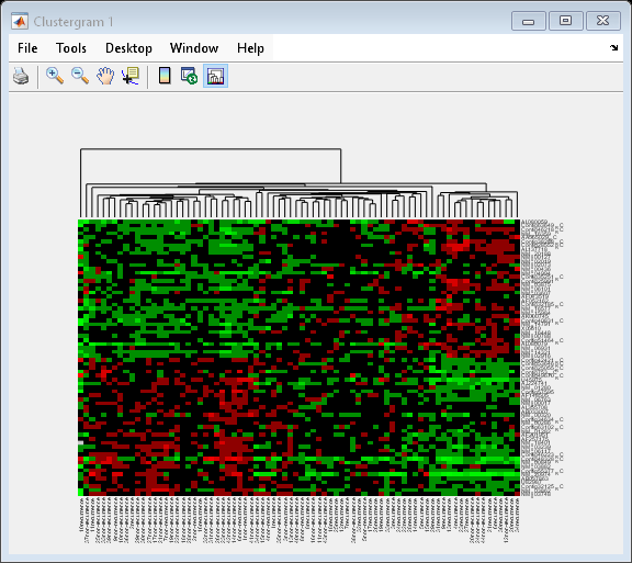
The dendrogram at the top of the heat map shows the clustering of samples. The missing data are shown in the heat map in gray. The data has been standardized across all samples for each gene, so that the mean is 0 and the standard deviation is 1.
Inspecting and Changing Clustering Options
You can determine and change properties of a clustergram object. For example, you can find out which distance metric was used in the clustering.
cg_s.ColumnPDist
ans =

  1×1 cell array

    {'Euclidean'}
Then you can change the distance metric for the columns to correlation.
cg_s.ColumnPDist = 'correlation';
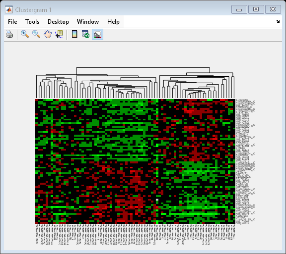
By changing the distance metric from Euclidean to correlation, the tumor samples are clearly clustered into a good prognosis group and a poor prognosis group.
To see all the properties of the clustergram, simply use the get method.
get(cg_s)
               Cluster: 'ROW'
              RowPDist: {'Euclidean'}
           ColumnPDist: {'correlation'}
               Linkage: {'Average'}
            Dendrogram: {}
      OptimalLeafOrder: 1
              LogTrans: 0
          DisplayRatio: [0.2000 0.2000]
        RowGroupMarker: []
     ColumnGroupMarker: []
        ShowDendrogram: 'on'
           Standardize: 'NONE'
             Symmetric: 1
          DisplayRange: 3
              Colormap: [11×3 double]
             ImputeFun: {[@knnimpute]}
          ColumnLabels: {1×78 cell}
             RowLabels: {70×1 cell}
    ColumnLabelsRotate: 90
       RowLabelsRotate: 0
              Annotate: 'off'
        AnnotPrecision: 2
            AnnotColor: 'w'
     ColumnLabelsColor: []
        RowLabelsColor: []
     LabelsWithMarkers: 0
Clustering the Rows and the Columns of a Data Set
Next, you will cluster both the rows and the columns of the data to produce a heat map with two dendrograms. In this example, the left dendrogram shows the clustering of the genes (rows), and the top dendrogram shows the clustering of the samples (columns).
cg = clustergram(progValues, 'RowLabels', progAccession,...
                             'ColumnLabels', progSamples,...
                             'RowPdist', 'correlation',...
                             'ColumnPdist', 'correlation',...
                             'ImputeFun', @knnimpute)
Clustergram object with 70 rows of nodes and 78 columns of nodes.
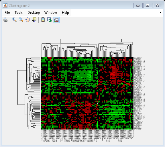
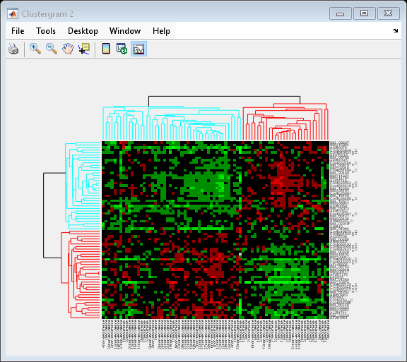
You can also change the dendrogram option to differentiate clusters of genes and clusters of samples with distances 1 unit apart.
cg.Dendrogram = 1;
Interacting with the Heat Map
You can zoom in, zoom out and pan the heat map by selecting the corresponding toolbar buttons or menu items.
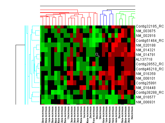
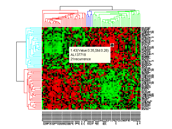
Click the Data Cursor button or select Tools > Data Cursor to activate Data Cursor Mode. In this mode, click the heat map to display a data tip showing the expression value, the gene label and the sample label of current data point. You can click-drag the data tip to other data points in the heatmap. To delete the data tip, right-click, then select Delete Current Datatip from the context menu.
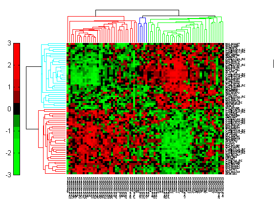
Click the Insert Colorbar button to show the color scale of the heat map.
Interacting with the Dendrogram
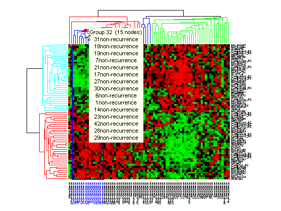
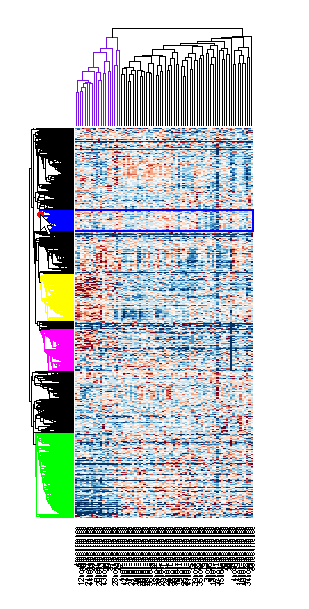
To interact with dendrogram, be sure that the Data Cursor Mode is deactivated (click the Data Cursor button again). Move the mouse over the dendrogram. When the mouse is over a branch node a red marker appears and the branch is highlighted.
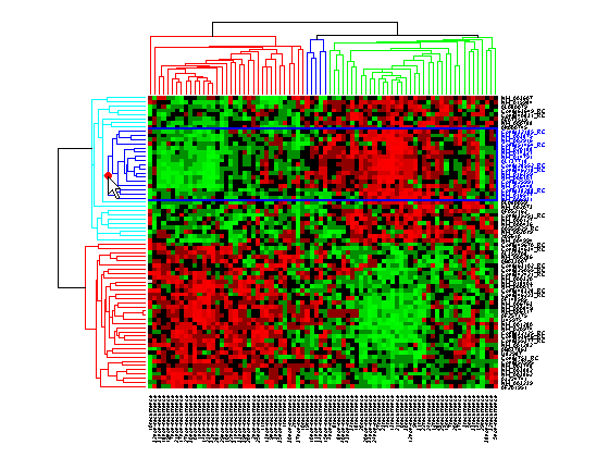
Click and hold the red marker to display a data tip with the group number and the number of nodes in the group. If the space is available, it also displays the labels for the nodes. For example, mouse over and click on a dendrogram clustering group of the samples.
Right-click the red marker to display a context menu. From the context menu you can change the dendrogram color for the select group, print the group to a separate Figure window, copy the group to a new Clustergram window, export it as a clustergram object to the MATLAB® Workspace, or export the clustering group information as a structure to the MATLAB® Workspace.
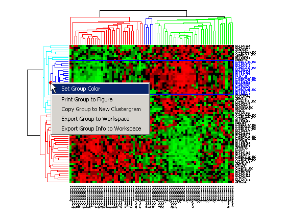
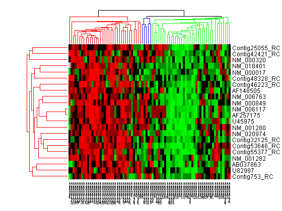
For example, select group 55 from the gene clustering dendrogram, and export it to the MATLAB® Workspace by right-clicking then selecting Export Group to Workspace. You can view the dendrograms and heat map for this clustergram object in a new Clustergram window by using the view method.
Changing the Color Scheme and Display Range
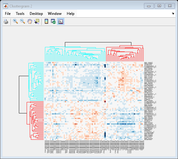
The default color scheme is the red-green color scale that is widely used in microarray data analysis. In this example, a different color scheme may be more useful. The colormap option allows you to specify an alternate colormap.
cg.Colormap = redbluecmap;
cg.DisplayRange = 2;
Adding Color Markers
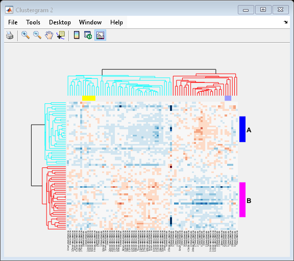
The clustergram function also lets you add color markers and text labels to annotate specific regions of rows or columns. For example, to denote specific dendrogram groups of genes and groups of samples, create structure arrays to specify the annotations for each dimension.
Create a structure array to annotate groups 34 and 50 in the gene dendrogram.
gene_markers = struct('GroupNumber', {34, 50},...
                      'Annotation', {'A', 'B'},...
                      'Color', {'b', 'm'});
Create a structure array to annotate groups 63 and 65 of the sample dendrogram.
sample_markers = struct('GroupNumber', {63, 65},...
                      'Annotation', {'Recurrences', 'Non-recurrences'},...
                      'Color', {[1 1 0], [0.6 0.6 1]});
Add the markers to the clustergram.
cg.RowGroupMarker = gene_markers;
cg.ColumnGroupMarker = sample_markers;
Clustering 5000 Significant Genes
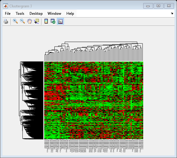
In this example, you will perform hierarchical clustering for almost 5,000 genes of the filtered data [2].
cg_all = clustergram(bcTrainData.Log10Ratio,...
                                'RowLabels', bcTrainData.Accession,...
                                 'ColumnLabels', bcTrainData.Samples,...
                                 'RowPdist', 'correlation',...
                                 'ColumnPdist', 'correlation',...
                                 'Displayrange', 0.6,...
                                 'Standardize', 3,...
                                 'ImputeFun', @knnimpute)
Clustergram object with 4918 rows of nodes and 78 columns of nodes.
Tip: When working with large data sets, MATLAB® can run out of memory during the clustering computation. You can convert double precision data to single precision using the single function. Note that the gene expression data in bcTrainData are already single precision.
You can resize a clustergram window like any other MATLAB® Figure window by click-dragging the edge of the window.
If you want even more control over the clustering, you can use the clustering functions in the Statistics and Machine Learning Toolbox™ directly. See the Gene Expression Profile Analysis example for some examples of how to do this.
References
[1] Eisen, M. B., et al., "Cluster analysis and display of genome-wide expression patterns", PNAS, 95(25):14863-8, 1998.
[2] van't Veer, L., et al., "Gene expression profiling predicts clinical outcome of breast cancer", Nature, 415(6871):530-6, 2002.