Radio Button
Change parameter or variable value during simulation using radio button with customizable appearance
Since R2025a
Libraries:
Simulink /
Dashboard /
Customizable Blocks
Description
Use the Radio Button block to change the value of the connected parameter or variable before or during simulation. When you use the Radio Button block in the Customizable Blocks library, you can customize the appearance of the block, for example, to make the block look like a radio button in a digital user interface you are designing. Use the Radio Button block with other dashboard blocks to build an interactive dashboard of controls and indicators for your model.
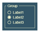
Each radio button option corresponds to a state of the Radio Button block. The state has a label and a value. The state label is the text on the block that identifies the option. When you select an option, the Radio Button block enters the associated state and assigns the state value to the connected parameter. To select an option on the Radio Button block during simulation, click the radio button icon or label text of the option you want to select. To select an option when the simulation is not running, click the Radio Button block to select the block, then click the option icon or text.
To customize the state label or value, open the Parameters tab of the Property Inspector or the Block Parameters dialog box.
Note
Double-clicking a connected Radio Button block during simulation or after clicking the block does not open the Block Parameters dialog box. To open the Block Parameters dialog box, press Shift, then double-click the block.
Clicking a connected Radio Button block during simulation both selects the block and selects a radio button option. To select the block without selecting an option, press Shift, then click the block.
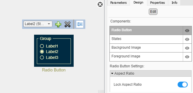
Customize Radio Button Blocks
When you add a Radio Button block to your model, the block is preconfigured with a default design. You can use the block with the default design or customize the appearance of the block.
To customize the appearance of the block, use design mode. After selecting the block, you can enter design mode in one of three ways:
In the Simulink® Toolstrip, on the block-specific tab, under Design, click Edit.
In the Property Inspector, on the Design tab, click Edit.
Pause on the ellipsis that appears over the block and click the Edit Custom Block button
 .
.
In design mode, you can use the toolbar above the block to customize the radio buttons. To access additional customization options or to enter exact values for design settings, use the Design tab in the Property Inspector.
Design Mode Actions
| Action | Available in Toolbar | Available in Design Tab |
|---|---|---|
| Change the value each option assigns to the connected parameter. | No | Yes |
| Change the text of the option labels. | No | Yes |
| Add or remove options. | Yes | Yes |
| Upload an icon that represents a selected radio button. | No | Yes |
| Upload an icon that represents a cleared radio button. | No | Yes |
| Change on which side of the labels the radio button icons are located. | No | Yes |
| Add a border around the list of options and a title above the list. | No | Yes |
| Change the title of the list of options. | No | Yes |
| Change the border thickness. | No | Yes |
| Change the color of the border and title. | No | Yes |
| Upload a background image. | No | Yes |
| Set a solid background color. | No | Yes |
| Upload a foreground image. | No | Yes |
To change the font color of the option labels, select the Radio Button block, and in the Simulink Toolstrip, on the Format tab, change the foreground color.
When you finish editing the design, to exit design mode, click the X in the upper right of the canvas.
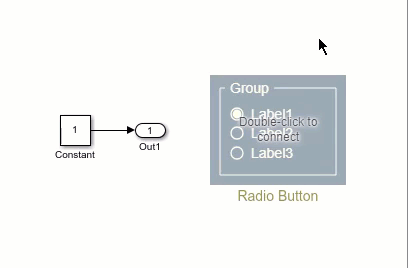
Connect Dashboard Blocks
Dashboard blocks do not use ports to connect to model elements. To connect a dashboard
block, use connect mode. To enter connect mode on an unconnected block, pause on the block
you want to connect and click the Connect button  . To enter connect mode on a connected block, select the
block, pause on the ellipsis that appears (…), and in the action menu that expands, click
the Connect button.
. To enter connect mode on a connected block, select the
block, pause on the ellipsis that appears (…), and in the action menu that expands, click
the Connect button.
To connect a control block to a parameter in your model or to change the connection of a
control block, enter connect mode. Select the block to whose parameter you want to connect.
From the list that appears, select the parameter to which you want to connect. Then, pause
on the dashboard block and click the Done Connecting button .
The control block cannot connect to a parameter whose value is a variable until you update the model diagram. To connect to a parameter whose value is a variable or to modify the value of a variable that is the value of a connected parameter when the simulation is not running, update the model diagram by pressing Ctrl+D.
You can connect to a parameter with a scalar value or to an element of a matrix or structure. For more information, see Connect Dashboard Blocks to Simulink Model.
You can also connect dashboard blocks to a Stateflow® chart. For more information, see Connect Dashboard Blocks to Stateflow (Stateflow).
This animation shows how to connect the Radio Button block to your model.
Parameter Logging
Tunable parameters connected to dashboard blocks are logged to the Simulation Data
Inspector, where you can view the parameter values along with logged signal data. You can
access logged parameter data in the MATLAB® workspace by exporting the parameter data from the Simulation Data Inspector
by using the UI or the Simulink.sdi.exportRun function. For more information about exporting
data using the Simulation Data Inspector UI, see Export Data From Simulation Data Inspector to Workspace or File. The
parameter data is stored in a Simulink.SimulationData.Parameter object, accessible as an element in the
exported Simulink.SimulationData.Dataset.
Limitations
Except for the Dashboard Scope block and the Display block, dashboard blocks can only connect to real scalar signals.
You cannot use the Connection table in the Block Parameters dialog box to connect a dashboard block to a block that is commented out. When you connect a dashboard block to a commented block using connect mode, the dashboard block does not display the connected value until the you uncomment the block.
Dashboard blocks cannot connect to model elements inside referenced models.
When you simulate a model hierarchy, dashboard blocks inside referenced models do not update.
Dashboard blocks do not support rapid accelerator simulation.
When you connect a dashboard block to a variable or parameter during simulation, the data for that variable or parameter is not logged to the Simulation Data Inspector. To log variable and parameter data to the Simulation Data Inspector, connect the dashboard block to the variable or parameter prior to simulation.
When you simulate a model in external mode with the Default parameter behavior set to Inlined, dashboard blocks can appear to change parameter and variable values. However, the change does not propagate to the simulation. For example, Gain blocks display changes made to the Gain parameter using the dashboard blocks, but the Gain value used in the simulation does not change.
Parameters
Block Characteristics
Data Types |
|
Direct Feedthrough |
|
Multidimensional Signals |
|
Variable-Size Signals |
|
Zero-Crossing Detection |
|